A&M Research
Accuracy and consistency
As the Creative Manager within the Division of Research, we straddled between two very different goals. Custom high-end pieces for prestigious campus programs and simple, low-budget templates to distribute across a vast organization ensuring brand consistency. I stretched my mentoring and event-related design muscles a lot in this position and I’m proud to share the results.
̌

The Division of Research is uniquely situated within the university but is also the branding liaison to many system- and partner- institutes, centers and services - a branding challenge to say the least. We’ve worked over the last year to develop many internal branding templates, including fact sheets, presentations, programs, invitations and advertising that accounts for a cohesive look with the flexibility to adjust for those funding-based exceptions.


Color palettes and font styles have been carefully chosen to work with the university brand while allowing for a unique feel within our Division.

Universal slide deck, using only PC-system fonts, allowed for the maximum number of users to quickly adopt and adapt existing presentations across multiple branches, buildings, and OS systems.

Program templates for letter-, legal- and tabloid-sized needs were developed to expedite in-house capabilities and minimize staff time.
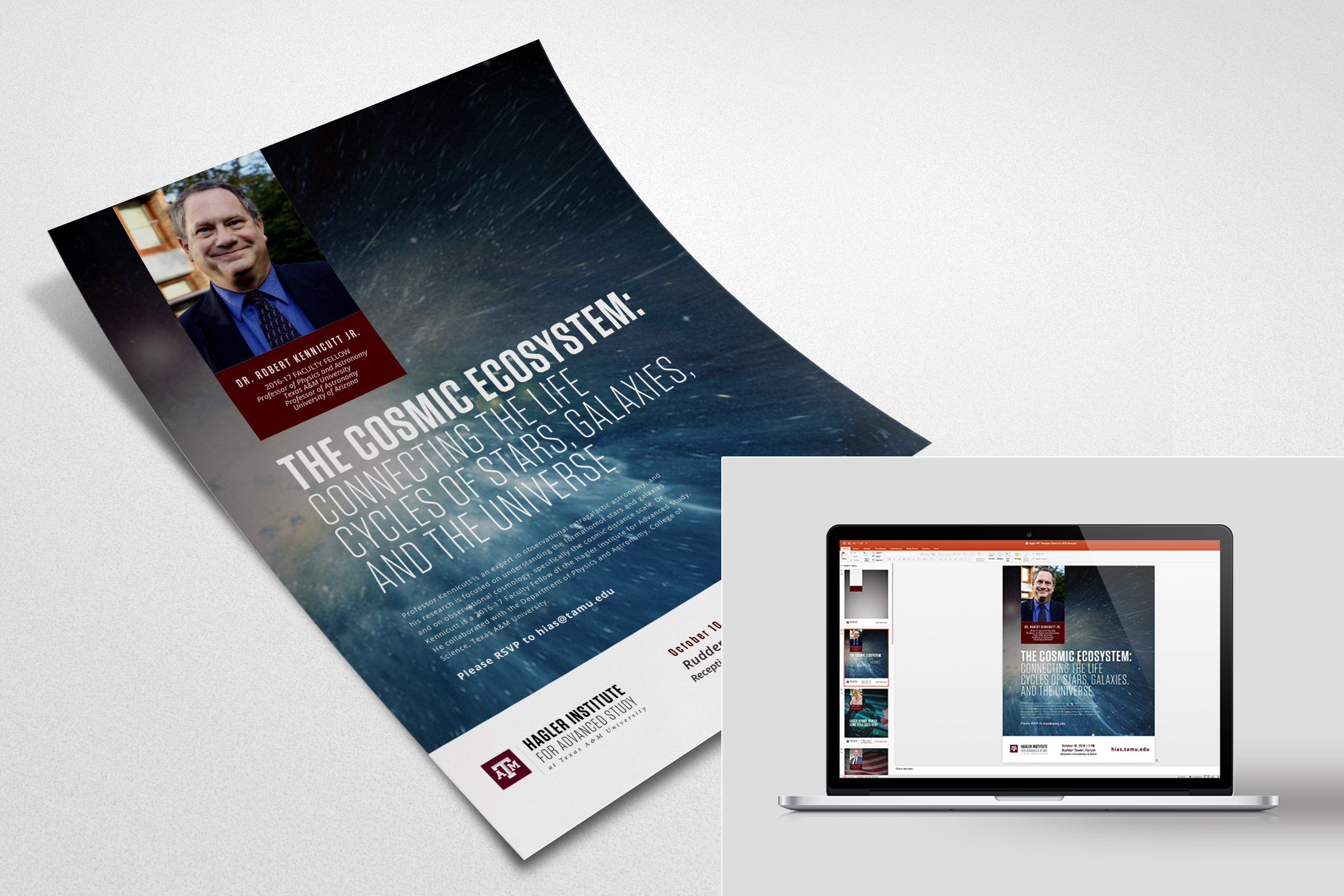
Templates for basic flyers were developed in Powerpoint to allow for maximum distribution, minimum effort while encouraging consistency.

Flyer templates (PPT) were also designed to allow the end user to quickly crop the image to create an email header, delivering multiple design elements for events, without proprietary software.

For the new Vice President of Research, simplicity and minimalism are the priorities. Our leader prefers to create and adapt his presentations on the fly. We developed a very simple and modern aesthetic that would be unique to his voice/style.

Generic WordPress theme for research facilities.

Introducing the ability to charge/schedule large research equipment was an expressed mission for the success of the theme.

A series of email templates designed in MailChimp. Directions were to keep images very minimal and allow for long-format & structured text. Research tells us our faculty are avid readers with little patience for slow load times.

As Creative Manager, I mentor and art direct with our graduate, undergraduate student illustrator/videographers and provide visual elements for brand consistency. It’s been a blast to work with so many young creative minds.


Annual report for the Hagler Institute for Advanced Study. The mix of Neenah Touche in Sterling with the Sorbet Gold foil on the cover really set the tone for the piece.

Designs for this year’s report were themed around convergence of ideas. So I chose mixed neutrals, mixed metallics, contrasting background and mixed artwork styles (vintage halftones and modern dot-grids). Each spread revealed the places where opposing visual/textures/ideas could meet.

Staff portraits taken for publication.

Halftones are part of the A&M brand guide. I created a halftone global map and used ArcGIS software to pinpoint the exact locations of all 61 Hagler Fellows, including the 11 for the incoming class.


A black-tie affair, the Hagler Gala is an annual event celebrating the best and brightest research collaborations between A&M and external institutions such as Harvard, Princeton, and Cambridge.

Similarly the Hagler Gala this year used a design with triangles to represent that idea of opposing perspectives.
The triangular pattern shows points in opposition, building and meeting into a harmonious and pleasing unit. Representing the meeting of the minds that happens with these large-scale research collaborations. And show the strength of the community when multiple views coming together.
The juxtaposition of the holographic foil and the organic texture of Neenah Caneletto hit just the right note.

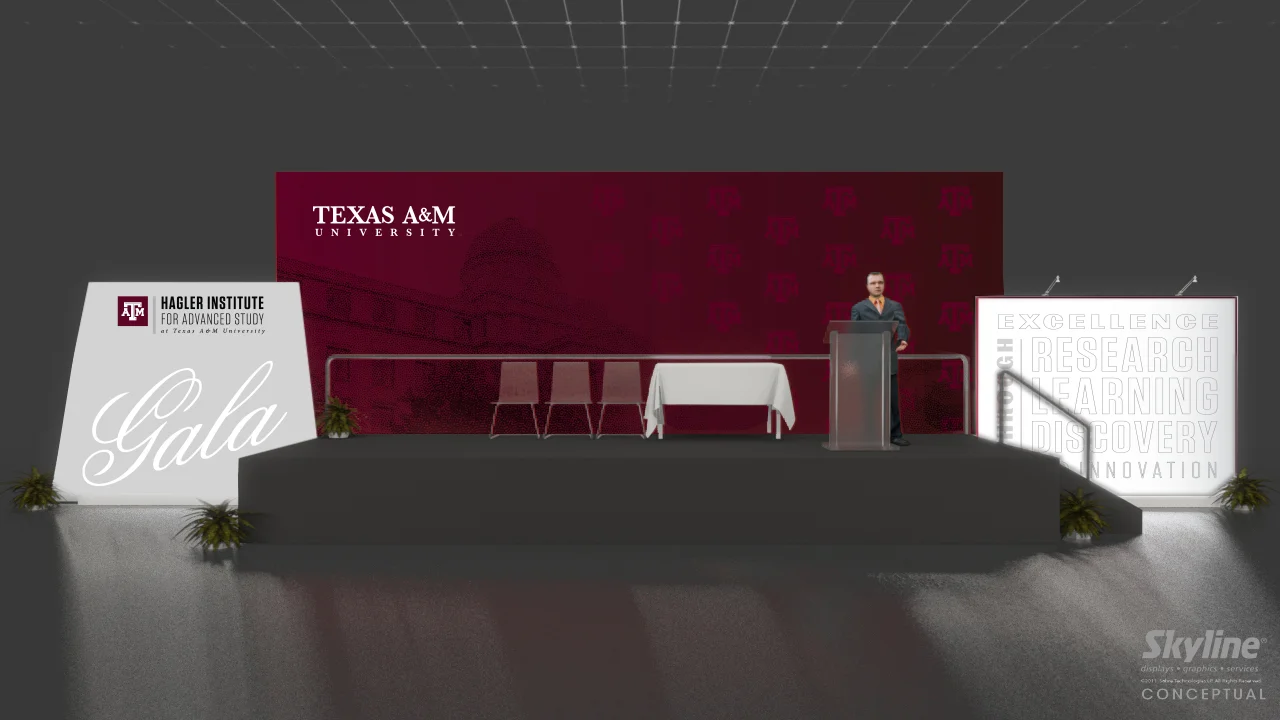
This year we redesigned the staging. It was a lot of logistics, but the hard work paid off.

Programs pulled graphic and physical elements from both the invitation and the annual report.


Metal bookmarks with custom laser-cut design.


Throughout the year, events are themed using elements from the annual report, reinforcing the brand experience at various touch points.


The first year for a campus-wide celebration of research, co-hosted by the Division of Research and the Office of the President. It was quite the coordination of teams, visuals and promotion. A day-long event including presentations, poster sessions and social interactions for a variety of research faculty, staff and community.

For this event, large-scale collaborative research is the highlight. In many teams work together on million-dollar grants. Our VP wanted a pyramid to represent the multiple-PI grants involved. After researching, I stumbled upon the “impossible triangle” and fell in love with the idea of using it. This simple, but complex shape represents how each part of the collaborative must continue to extend beyond their individual areas towards the near impossible, to find new discoveries in the space in-between.

One of several emails developed to increase awareness of the inaugural event.

The VIP lunch invitation and design supporting visual materials and finishes.

Staging elements for speakers in auditorium

Programs for both the main presentations and poster elements designed and produced in-house.

Large installations to create immediate impression upon entering the lobby of the conference center. Center staff remarked on not only those in attendance, but those who came earlier and afterwards remarked on how well these elements branded the area. A win.


Collaborative Triads inspired the pyramid theme. Marble pyramids with etched design were given to all T3 and X-Grant awardees as symbol of their accomplishment.

Social media promotion coordinated through the president’s office included an event, fb thread, Twitter posts and college collaborations. During day of event, many were seen participating and posting.

In advance of opening a new shared research facility, we created a brochure to showcase the unique research elements within the complex and a website to help facilitate contact with the director and facility manager.
Design needed to highlight the building, without showing the actual building, due to confidentiality/security issues related to the research. In addition materials were created before the building was finalized. So we had to be creative using textures, crops and stock photos.


To create a unique identity within the Texas A&M campus: brushstroke typography, biomedical textures and a modern palette grounded in the maroon & navy from the A&M brand colors. We wanted a progressive and innovative feel to the technology-based facility.
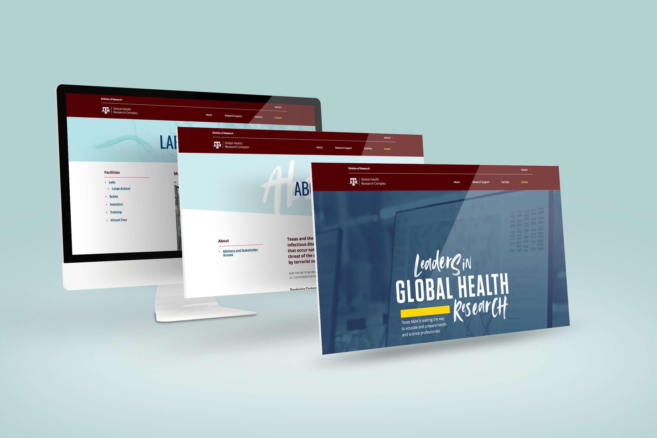
We also developed a Wordpress theme, including custom duotone video backgrounds, biomedical textures and a few parallax elements to keep things interesting.
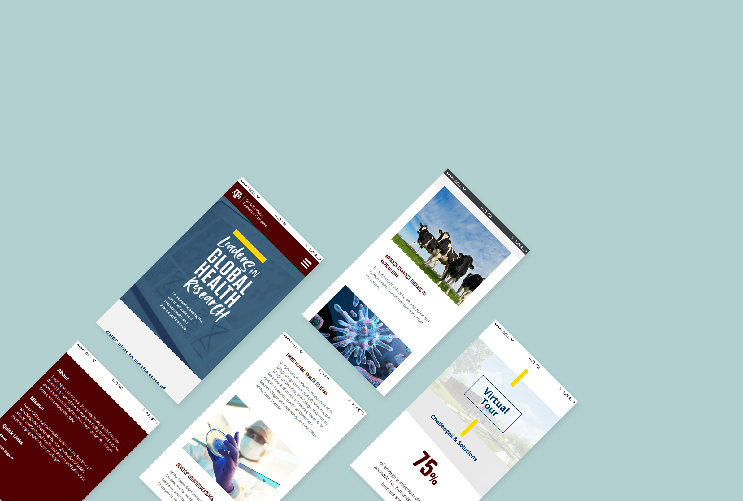
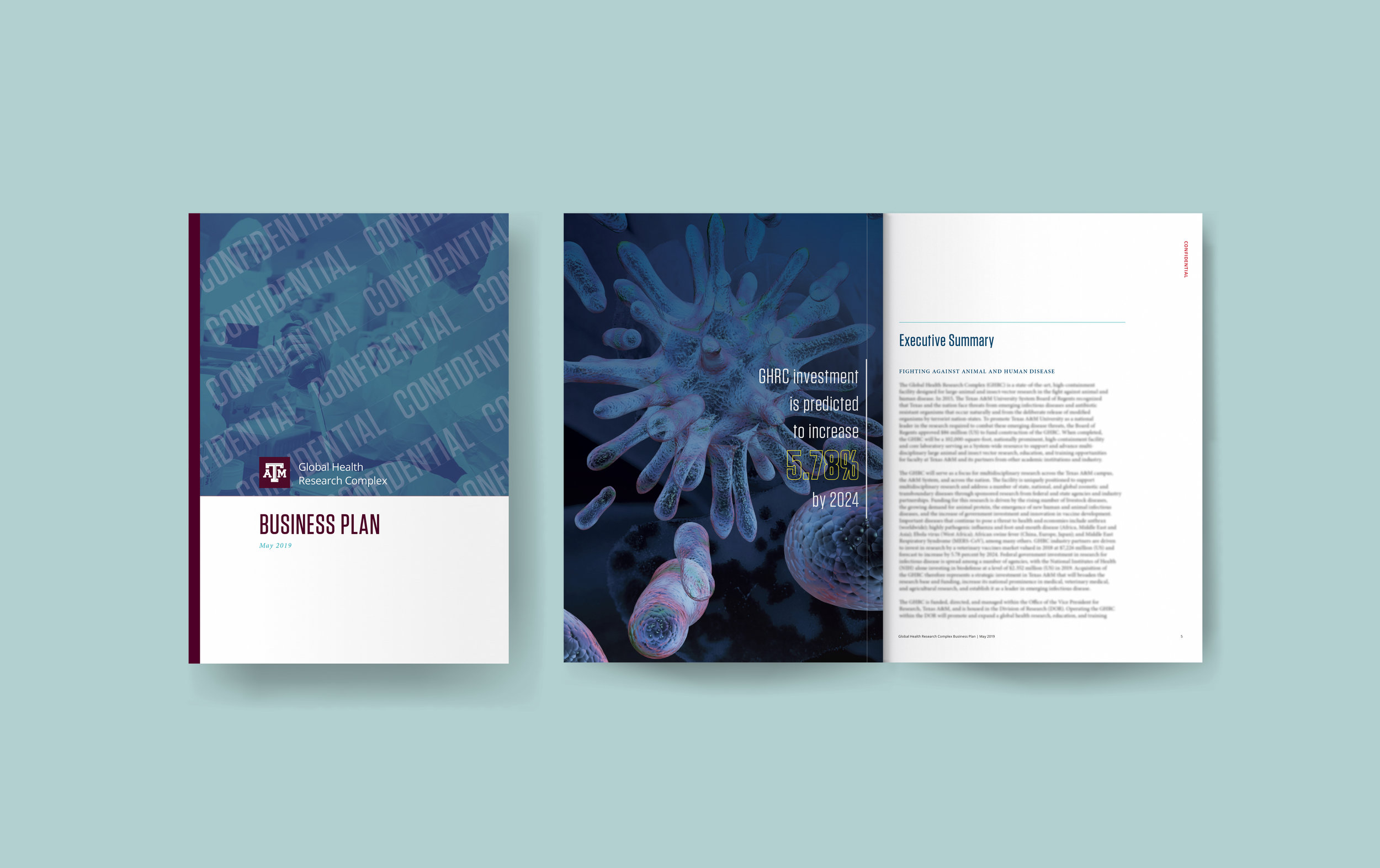
Report templates created in InDesign to expedite professional materials for meetings, visits and collaborations.
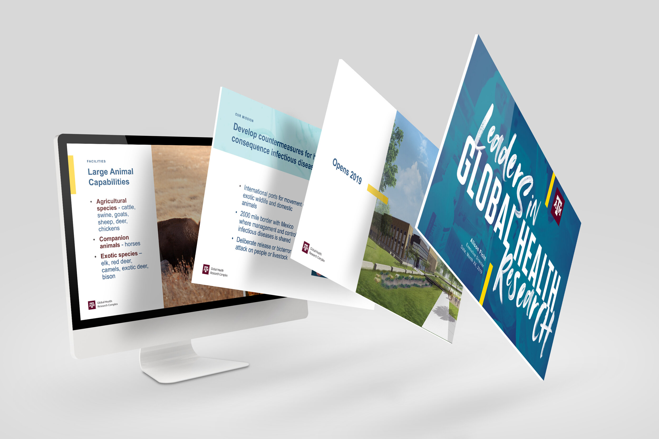
Powerpoint template created to allow for quick and easy updated information to stakeholders across campus.

Email templates also created for events and future communications.
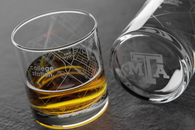
At building opening, we sourced these amazing whiskey glasses that had map of campus and the commemorating event details. They were a huge hit.

Adaptation of our previous Division-wide generic Wordpress theme with several custom-designed elements for this Center including lightbox, carousels and custom reservation system.


The center is a facility that captures micro and nano-level imagery for the A&M campus. Previous website design didn’t allow them to highlight the images they are capturing or showcase the capability of the technology. So we designed this theme to showcase the last 4 “picture of the month” (see bottom right corner of first image) and draw more attention to featured equipment, which is the primary function and money-maker for the center.


