A&M Science
Be Curious.
A 3-man creative team for one college, five departments and 11 centers. Not a problem. At the College of Science, I spent most of my time creating visuals, taking photos and building templates that could be used across a large organization. Efficiency and budgets were a priority. Streamlining processes and making things simple were usually on the goals list. Our tight team worked together to create a brand identity founded on the concept of curiosity.
̌

Texas A&M University

Our communications team self-initiated to update our previous monthly science email newsletter to a more modern & responsive design. Our priority was to align with overall university branding, while updating to a more modern styling and to keep a clean/minimal approach to the graphics. Custom-created forms were built through mySQL/PHP for the writers & editors uploading new or choosing prior published content to the news archive on the website. Information stored in tables produced both a responsive HTML email-standardized code and online archive on the website. This minimized work involved for an already overworked staff.

An auto-generated online version on our website for archived materials was developed as well, so you can quickly view up to a year of the newsletter through a few simple clicks. All original content was maintained in a central database and automatically distributed to the website/email system through mySQL/PHP. So there was literally a one-point change system for email, online and website — should the need arise for a change of content.


Originally, we initiated the redesign of our college website to adapt us to a responsive framework. After discussing needs with our dean & coworkers, we adapted the goal to implement a new framework while also adapting the look to our new university branding and adding more automated content from our SQL database system. Ideally this would help streamline maintenance of information for a limited staff, increase visibility of our faculty & student research and improve the impression of our college for potential students & donors. After researching trends and polling internal communicators, we went with Bootstrap.

Because we had a strong news department. Emphasis is given to our news content. Categorization of all news content helps to keep fresher content highlighted across the site, no matter what the entry-point, and coordinates with our social media and email newsletter.


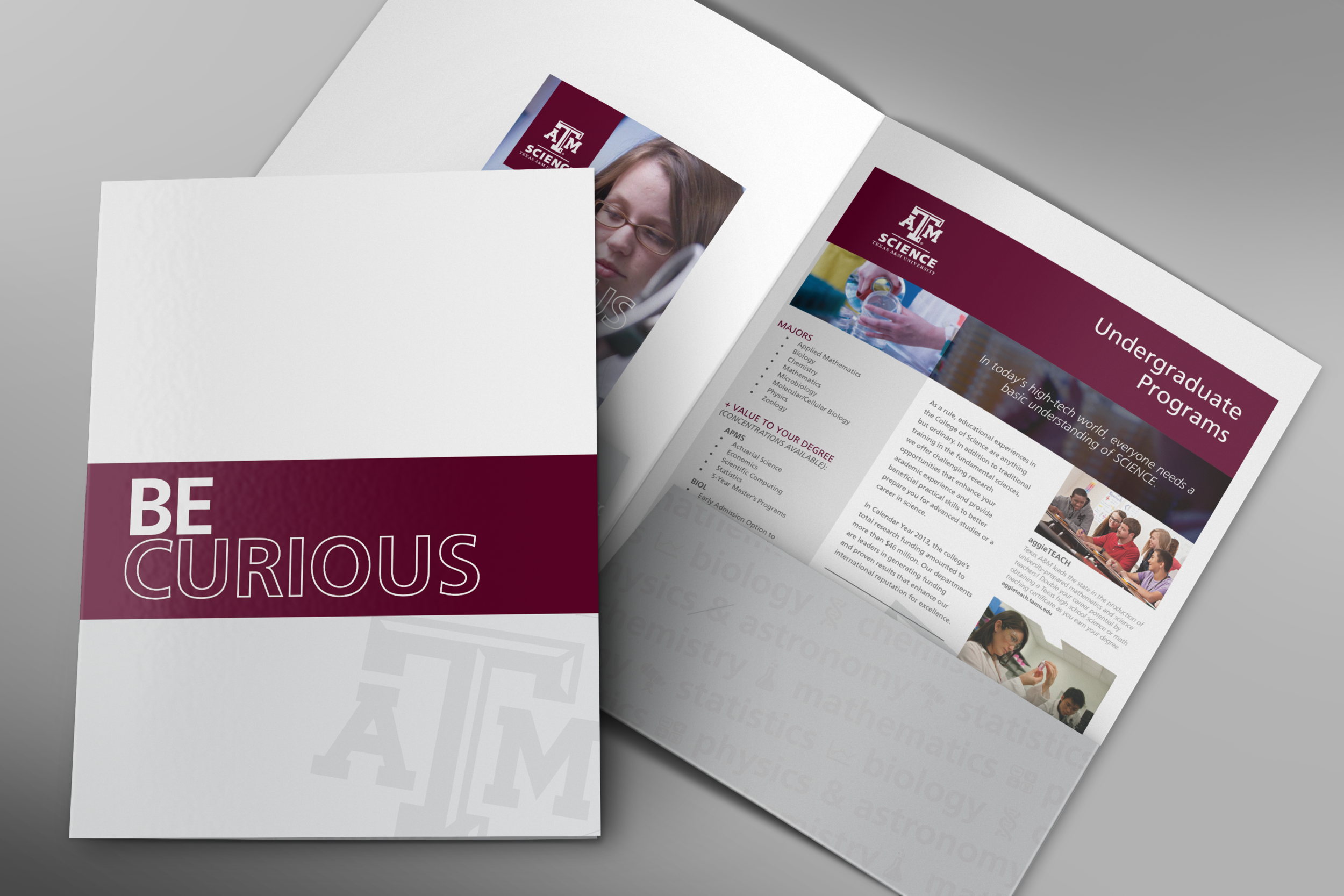
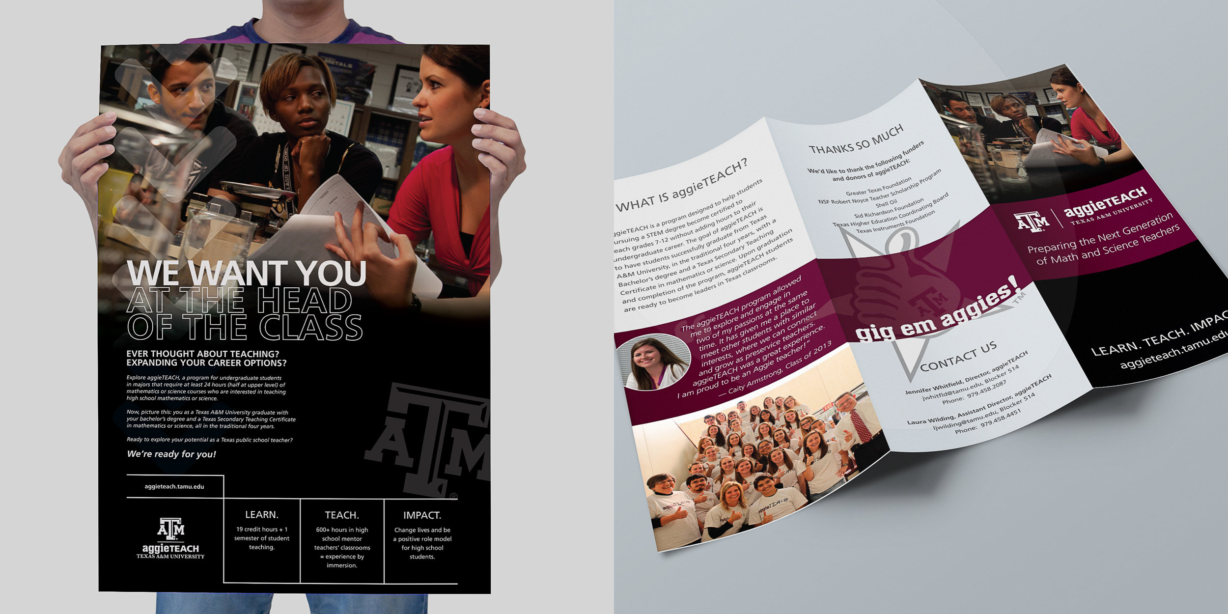
A folder system with inserts printed in-house allowed us to have the flexibility we needed, kept us from having invested too much in print inventory and gave us the ability to quickly create additional collateral for both one-offs and digital use. Later we added trifolds, rack cards and postcards to allow for visual variety and weight to the system.


aggieTEACH, a program within the College of Science at Texas A&M, seeks to encourage more math & science majors to become teachers. We took the existing tagline "Learn. Teach. Impact." to create a simplified 1-2-3 approach to explain how to get involved in the program. We collaborated with the amazing Igor Kraguljac for our photography and videography needs. Our team did the preparation and coordinated day-of production, while Igor handled the details of directions and shooting. The results of the collaboration were used in the print materials and the new website (designed in WordPress).


Inspired by the pattern of the tessellations on the floor in the new building, we used the blueprints to create the invitation suite, program and other event materials to showcase this $50-million building for the Physics department. Special double-bumped UV and metallic ink on black papers kept the event looking high dollar, but because we used only 1-color ink, the cost was actually much less than if we had done the traditional 4/4.


The Analytics program was uniquely housed out of the Houston branch campus, targets MBAs returning to school. We added billboards to the campaign to catch the commuters during traffic.


